

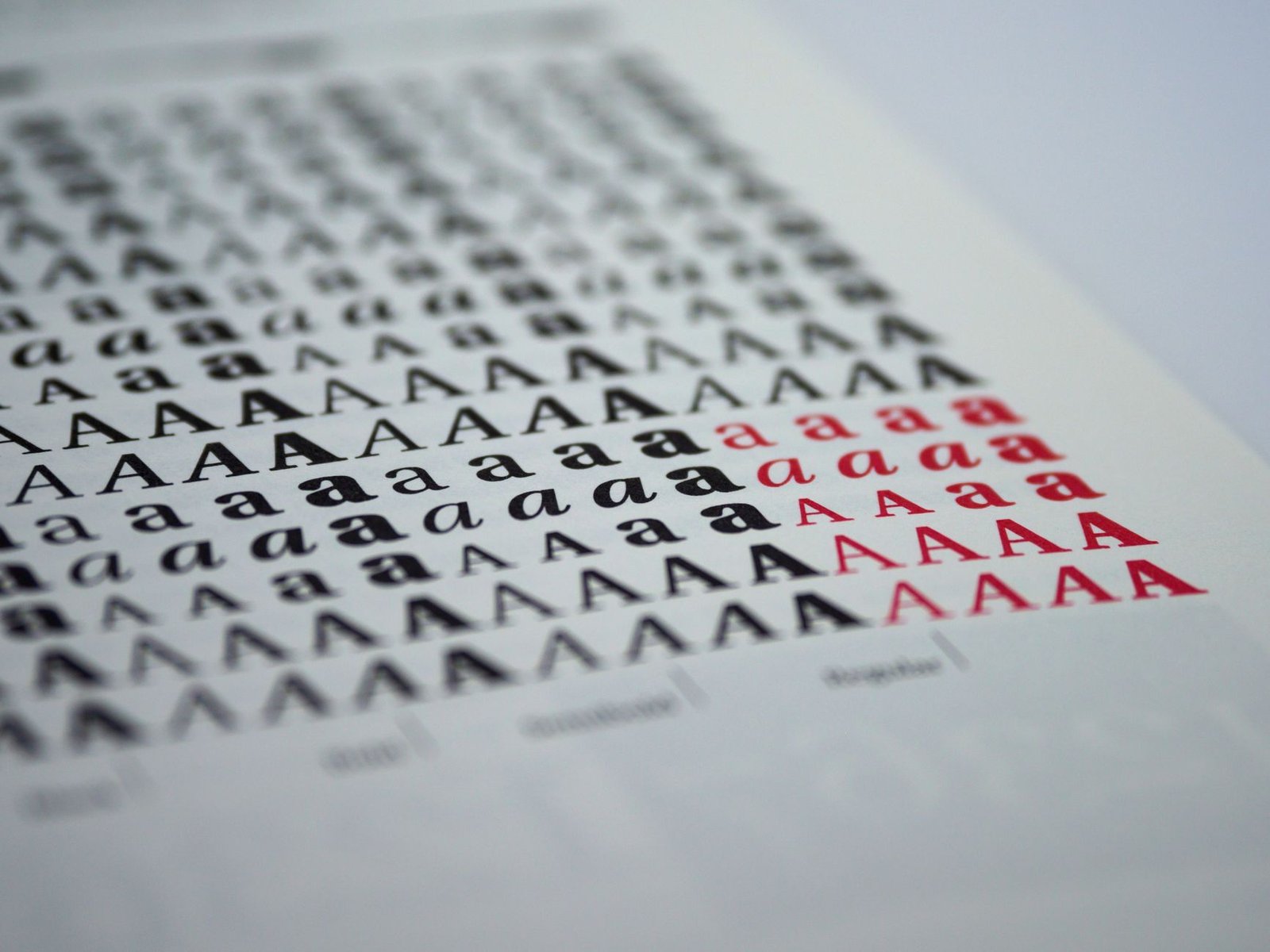
Before an event organizer reads a single word on a speaker website, they have already read the fonts. Typography is processed as a visual impression before it is processed as language, and that impression decides whether the site feels like the online home of a premium professional or one more template with a name swapped in. The words can be perfect. If they are set in the same fonts as ten thousand other websites, the site still whispers generic.
The good news is that distinctive typography costs nothing. Google Fonts now offers more than 1,800 free families, all licensed for commercial use, all optimized for the web. The problem was never access. The problem is that almost everyone downloads the same six fonts from that enormous library, which is exactly why so many speaker websites look interchangeable. Choosing from the other 1,794 is one of the cheapest premium upgrades available to any speaker.
This guide covers the font pairings that make a keynote speaker website feel designed rather than assembled, matched to different speaker positioning styles, with practical notes on how to deploy each one. Every font here is completely free, and every pairing was chosen against one hard rule: nothing from the overused list.
The six fonts that make speaker websites invisible
There is nothing technically wrong with any of these fonts. They are clean, readable, and professionally made, which is exactly how they became the default choice for millions of websites, and exactly why they no longer say anything about the brand using them. Design industry commentary in 2025 and 2026 consistently names the same offenders, describing how their once-distinctive character has faded into what one designer called a tired trendiness.
For a speaker, this matters more than for most businesses because differentiation is the entire game. A speaker’s whole positioning argument is that they are not interchangeable with the other names on the shortlist. A website set in the same fonts as everyone else quietly argues the opposite.
How good font pairings work
A pairing is two fonts with clearly different jobs. One carries the personality in headlines and large text. The other carries the reading in paragraphs, navigation, and details. The most reliable formula is contrast: an expressive serif for headings with a clean sans-serif for body, or a characterful sans-serif display over a calm reading font. Two families is the ceiling. Every professional source on web typography agrees on this point, because a third font almost always makes a page feel scattered rather than rich. Hierarchy beyond that comes from weights and sizes within the two families, not from adding more fonts.
With that principle set, here are six pairings that give a speaker website a distinct typographic identity, each matched to a different positioning style.
The performance detail most font advice skips
Fonts are files, and files affect speed. Load a font family the old way, with separate files for every weight and style, and a website can easily carry 400 to 800KB of typography before a single image appears. On the mobile connections where organizers actually open speaker websites, that weight works directly against the three-second window covered in this blog’s post on mobile optimization.
This is why variable fonts matter, and why they quietly became the standard in 2025 and 2026. A variable font packs every weight into a single file, typically 100 to 200KB, replacing what used to take four or five separate downloads. Several of the fonts recommended above, including Fraunces, Hanken Grotesk, Bricolage Grotesque, and Manrope, are variable fonts, which means a distinctive typographic identity and better Core Web Vitals at the same time. Load only the weights you actually use, serve the fonts correctly, and typography becomes a speed asset instead of a speed problem. This is part of the build discipline on every professionally optimized site.
The rules that keep any pairing working
- Two font families maximum. Personality comes from the pairing, hierarchy comes from weights and sizes within it.
- Body text at 16px or larger. Elegant fonts set too small stop being elegant and start being unreadable, especially on phones.
- Display fonts stay in display sizes. A characterful headline font used for paragraphs exhausts the reader within two sentences.
- Test the pairing on a real phone before committing. High-contrast serifs like Cormorant Garamond can thin out on small screens and need their sizes checked on an actual device.
- Match the font to your positioning, not to your personal taste. The pairing should sound like your keynote feels.
- Stay consistent everywhere. The same typographic identity should carry across your website, media kit, and slide templates, so every touchpoint reinforces the same brand.
Are Google Fonts really free for commercial use on a speaker website?
Yes, completely. Every font in the Google Fonts library is open source and licensed for commercial and personal use with no fees, no attribution requirements, and no limits on traffic or usage. That covers websites, logos, media kits, slide decks, and printed materials. This makes the library one of the few places where a speaker can get typography of professional foundry quality at zero cost, which is exactly why the only real challenge is choosing distinctively rather than defaulting to the same families as everyone else.
What fonts should a keynote speaker avoid on their website?
Avoid the most overused families: Montserrat, Poppins, Roboto, Open Sans, Lato, and Raleway. None of them are bad fonts, but they appear on so many millions of websites and free templates that they make any site using them feel generic by association. Also avoid highly decorative display fonts for anything beyond a logo, and avoid very thin font weights for body text, which become hard to read on mobile screens. The goal is a pairing distinctive enough to feel designed and restrained enough to stay professional.
How many fonts should a speaker website use?
Two font families: one for headings and display text, one for body text and interface elements. This is the consistent recommendation across professional web typography guidance, because two families create contrast and personality while a third almost always makes a page feel scattered. All further hierarchy, from section headings down to captions, should come from different weights and sizes within those two families rather than from additional fonts. Fewer families also means fewer font files to load, which keeps the website faster.
Do fonts affect website speed and SEO?
Yes. Font files add to page weight, and poorly loaded fonts cause both slow rendering and the layout shifts that Google measures in its Core Web Vitals, which feed directly into rankings through page experience signals. The modern solution is variable fonts, which pack all weights into a single file of roughly 100 to 200KB instead of several separate downloads totaling far more. Loading only the weights actually used, and serving fonts with correct display settings so text appears immediately, keeps distinctive typography from costing any speed. Done properly, font choice and site performance support each other rather than compete.
Typography is chosen for you, not picked from a dropdown
Every StageNexa speaker website gets a typographic identity matched to the speaker’s positioning, loaded for speed, and tested on real devices, never the same defaults as every template on the internet. Book a free call and we will look at what your current fonts are quietly saying about your brand.