

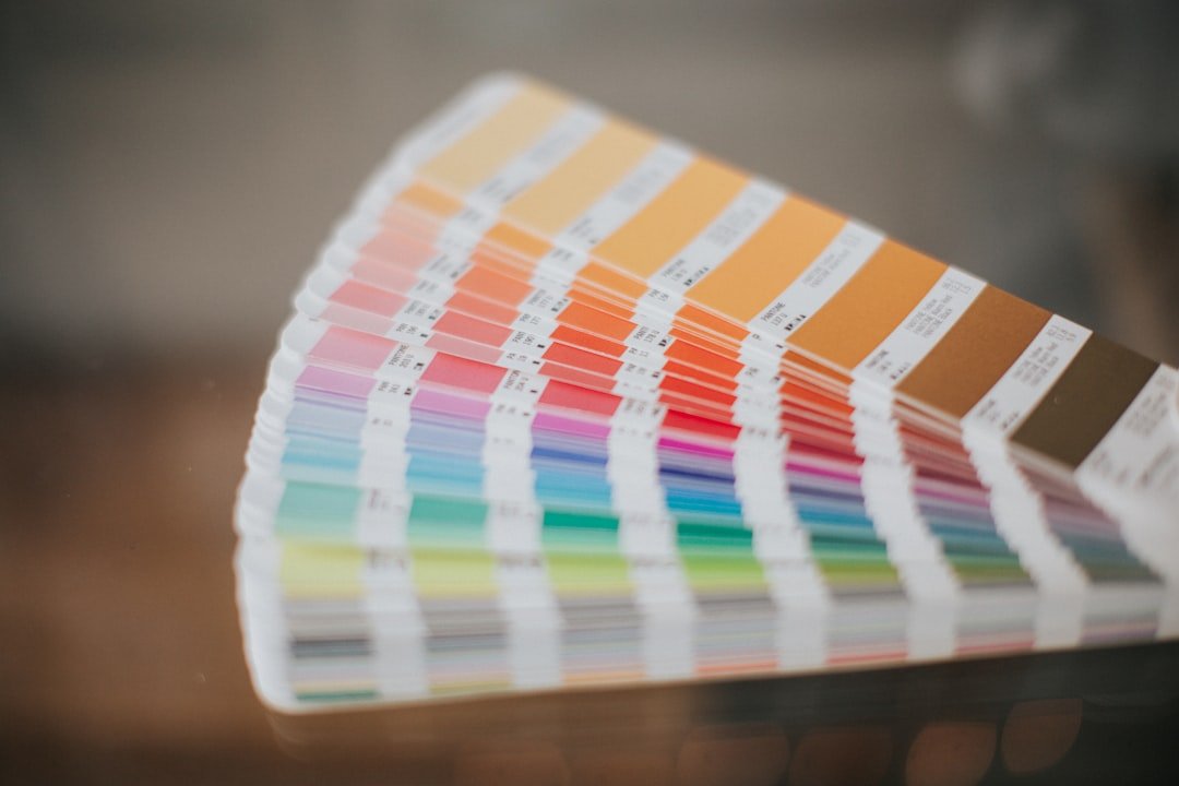
Color is usually the last thing speakers think about when building their website. It should be one of the first. The moment an event organizer lands on your site, the color palette signals something before a single word is read. It communicates whether you are premium or budget, energetic or measured, credible or amateur. Get it right and the rest of the site has a foundation. Get it wrong and even the sharpest copy struggles to recover it.
Below are ten speaker website color schemes built specifically for this niche. Each palette has a clear purpose, five to six colors with defined roles, and hex codes ready to use. Pick the one that matches the room you are trying to own.
01. Midnight Authority
Dark, powerful, and unmistakably premium.
When you want the site to feel like a first-class boarding pass, this is the palette. Deep midnight blue holds authority without aggression. Electric violet breaks the monotony and signals that this is not a generic corporate brand. Burnished gold adds the premium cue that high-fee speakers need without leaning into cliché. Everything else steps aside.
Deep Midnight
Primary
Electric Violet
Accent
Burnished Gold
Highlight
Warm White
Background
Slate
Body Text
Dark Slate
Dark Sections
Best for: Corporate leadership speakers, C-suite coaches, high-ticket keynote speakers, executive advisors
Feeling it creates: Authority, exclusivity, confidence, premium positioning
02. Desert Sage
Grounded, warm, and quietly trustworthy.
A palette rooted in the earth rather than the boardroom. Deep sage brings calm authority, the kind that does not need to announce itself. Terracotta keeps the energy human and warm, which matters enormously for speakers whose audience needs to feel safe enough to change. Ivory backgrounds breathe.
Deep Sage
Primary
Terracotta
Accent
Warm Ivory
Background
Sand
Dividers
Warm Earth
Body Text
Soft White
Cards
Best for: Wellness speakers, mindset coaches, female keynote speakers, transformation and resilience experts
Feeling it creates: Trust, warmth, safety, wisdom, grounded transformation
03. Cobalt Edge
Sharp, corporate, and built for business audiences.
Royal cobalt is the colour of precision and institutional trust. It tells a corporate event organizer that you know the room you are walking into. Signal red for CTAs cuts through with urgency. Ice blue section backgrounds keep long pages from feeling heavy, which matters when you have a lot to say about your offer.
Royal Cobalt
Primary
Navy Night
Dark Sections
Signal Red
CTA Accent
Ice Blue
Light Sections
Cool Gray
Body Text
White
Background
Best for: Finance and economics speakers, sales keynotes, business strategists, MBA program speakers, corporate trainers
Feeling it creates: Precision, trust, urgency, business credibility, professionalism
04. Obsidian Gold
Ultra-minimal. Ultra-premium. Nothing competes.
Two colours doing everything. Obsidian black sets the stage. Classic gold appears exactly where it needs to and nowhere else. This palette works because of what it removes, not what it adds. The cream background is the breath between the black and the gold. For speakers who have earned the right to say less.
Pure Obsidian
Primary
Classic Gold
Accent
Cream
Background
Carbon
Dark Sections
Warm Silver
Body Text
Best for: High-ticket keynote speakers, bestselling authors, luxury brand consultants, celebrity speakers
Feeling it creates: Luxury, restraint, power, exclusivity, gravitas
05. Arctic Current
Fresh, fast, and built for the future.
Sky cerulean carries the energy of forward momentum, the kind of colour that belongs on a TED stage. Mint teal as an accent adds dynamism without noise. The arctic white background keeps the whole thing moving fast, which matters for audiences who live in tabs and have attention spans trained by dashboards.
Sky Cerulean
Primary
Deep Ocean
Secondary
Mint Teal
Accent
Arctic White
Background
Dark Blue
Body Text
Ice Blue
Light Sections
Best for: Tech speakers, innovation keynotes, AI experts, future-of-work speakers, startup founders on stage
Feeling it creates: Innovation, momentum, optimism, clarity, forward thinking
06. Crimson Command
Bold. Memorable. Impossible to scroll past.
Deep crimson is one of the most emotionally activating colours in web design. Used with discipline it signals energy, urgency, and the confidence to be noticed. Paired with near-black and clean white it avoids aggression and lands closer to power. This palette stays in an organiser’s memory long after the tab is closed.
Deep Crimson
Primary
Jet Black
Secondary
Dark Crimson
Hover States
Near White
Background
White
Cards
Stone Gray
Body Text
Best for: Motivational keynote speakers, high-energy presenters, sports psychology experts, resilience coaches
Feeling it creates: Energy, passion, boldness, urgency, high impact
07. Forest Protocol
Purposeful, grounded, and built to last.
Forest night anchors every section with depth and seriousness. The warm gold lift is deliberate, it says this brand has standards and intention. Natural cream as a background makes long content feel easy to be with rather than clinical. This palette does not chase trends and that is exactly the point.
Forest Night
Primary
Medium Forest
Secondary
Warm Gold
Accent
Natural Cream
Background
Dark Wood
Body Text
Sage Mist
Dividers
Best for: Sustainability and ESG speakers, purpose-driven leaders, DEI keynotes, social impact thought leaders
Feeling it creates: Purpose, responsibility, depth, longevity, ethical authority
08. Violet Prestige
Creative, layered, and confidently distinct.
Deep violet is rare in the speaker market, and that rarity is a feature. Speakers who choose this palette immediately stand apart from the navy-and-white majority. Soft lavender as an accent keeps it from feeling heavy. Lavender white section backgrounds feel modern and airy without losing the depth that makes the brand memorable.
Deep Violet
Primary
Soft Lavender
Accent
Pale Lilac
Sections
Lavender White
Background
Near Black
Body Text
White
Cards
Best for: Creative and storytelling speakers, brand strategists, TEDx alumni, authors, podcast hosts with a speaker brand
Feeling it creates: Creativity, distinction, sophistication, imagination, individuality
09. Mocha Modern
Warm, approachable, and quietly premium.
Dark espresso gives this palette its warmth rather than its coldness, which is unusual and effective. It grounds the brand in something that feels human and earned rather than corporate and cold. Terracotta as the accent keeps the energy personal. Linen white breathes warmth into every background and makes even dense content feel inviting.
Dark Espresso
Primary
Warm Terracotta
Accent
Caramel
Highlight
Linen White
Background
Warm Brown
Body Text
White
Cards
Best for: Coaching speakers, personal development keynotes, women in leadership, holistic wellness experts
Feeling it creates: Warmth, humanity, approachability, personal connection, earned trust
10. Graphite Storm
Minimal, editorial, and built for thinkers.
Space black and pure white create the highest contrast possible at minimal cost. Electric blue is the only colour that appears, and when it does it earns every pixel. This palette is for speakers who lead entirely with ideas and whose credibility comes from depth of thinking rather than stage personality. The design steps out of the way.
Space Black
Primary
Electric Blue
Accent
System Gray
Light Sections
White
Background
Medium Gray
Body Text
True Black
Headlines
Best for: Thought leaders, bestselling authors, academic keynote speakers, TEDx alumni, industry analysts and futurists
Feeling it creates: Intelligence, clarity, editorial authority, intellectual depth, restraint
How to choose the right color scheme for your speaker website
Before you pick, ask one question. What does the organizer booking me need to feel the moment they land on my site? If the answer is authority and trust, go dark and minimal. If it is energy and momentum, go bold. If it is warmth and safety, go earthy. If it is innovation and forward thinking, go cool and clean. The right palette does not just look good. It speaks to the specific person who makes the booking decision before they read your first sentence.
What colors work best for a keynote speaker website?
Deep blues, dark neutrals, and restrained accent colors perform strongest for corporate and business audiences. Warmer palettes with earth tones work better for coaching, wellness, and transformation speakers. The most effective speaker websites use five to six colors with clear roles: primary for brand recognition, secondary for structure, accent for CTAs and highlights, background for readability, text for legibility, and an optional hover or highlight state.
Should a speaker website be dark or light?
Both can work exceptionally well. The most effective speaker websites combine both: dark for hero sections and feature areas to create immediate impact, light for body content to support readability. A fully dark site works for some premium brands but can make text-heavy pages feel heavy and hard to read. A fully white site can feel generic and underdesigned unless the typography and content do all the work.
How many colors should a speaker website use?
Five to six is the sweet spot. One primary that carries the brand identity, one secondary for structural contrast, one accent for buttons and CTAs, one page background color, one text color for body content, and one optional highlight for hover states and small details. More than six without a clear system creates visual noise that weakens the brand signal event organizers respond to.
Need help applying a color scheme to your speaker website?
At StageNexa we build authority-driven websites for keynote speakers that are strategic from color to copy. Book a free call and let us build yours.