Picture the person who decides whether you get on stage. She is an event organizer, probably between meetings, with a list of speakers to look through and not much time. She searches your name, clicks through to your site, and spends about eight seconds on it.
That is usually enough for her to decide.
I have built more than five hundred websites for speakers over the past six years, and the same thing comes up again and again. Speakers who are brilliant in a room often have websites that do not show it. Not because they are lazy, but because nobody told them what organizers are actually looking for when they land on a keynote speaker website.
So here is what I have picked up from building those five hundred sites, and from the organizers who gave honest feedback about what made them stop and what made them leave.
The first thing that matters is the very top of your homepage. Before an organizer reads anything, she has already formed a feeling about you based on how the page looks. Research from Carleton University found that people judge a website in about fifty milliseconds, which is faster than a blink. Most of that first impression comes down to design, not words.

But once she stays, the next thing she needs is a clear answer to one simple question. Is this person right for my audience? If your keynote speaker website does not answer that fast, she moves on. Not because she does not care, but because she is busy and has ten other tabs open.
This is where a lot of speakers go wrong. They write their homepage for themselves, not for the organizer. They lead with a long personal story, a big photo, or a tagline that sounds good but says nothing. Something like “inspiring change through storytelling” looks fine on paper but it does not tell an organizer who you help or what you speak about. A simple honest line works better. Who you are, who you help, what you talk about. One breath, and she knows whether to keep reading.
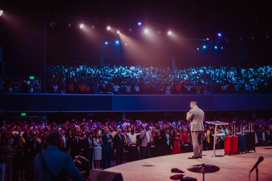
After that, she wants to see you in action. In 2026 a speaker reel is the most important thing on any speaker website. People hold on to about seventy percent of what they take in through video and live delivery, but barely five percent of what they read as plain text. So you can write a hundred words about your energy on stage, or you can let her watch thirty seconds of you actually being there. The second one does the convincing every time. Keep the reel near the top of the page and make sure it loads fast.
Then there is social proof. Logos of places you have spoken, a few lines from organizers who have worked with you, a book or a media feature if you have one. These are not decoration. They are the part that makes her feel safe saying yes. Nobody wants to be the first to take a chance on someone unknown. Your past stages give her permission to move forward.
What you write about your keynote topics also matters more than most speakers think. Listing topics as single words like leadership, resilience, or culture does not help the organizer match you to her event. She needs more. A topic like “how teams stay focused when everything around them is changing” tells her exactly who it is for and what her audience walks away with. Vague topics get scrolled past while specific ones get clicked.
The quiet reasons your keynote speaker website costs you bookings
Speed is one that most speakers never think about. A page that loads in one to three seconds loses around seven to eleven percent of visitors before they see anything. Let it drag to five seconds and you lose closer to forty percent. A slow site does not just feel bad. It quietly sends people away before they give you a chance.
Mobile is another one. Most organizers check speaker websites on their phones, often between sessions or on the way home. If your site breaks on a small screen, that is the version of you she remembers. It needs to feel just as clean and easy on a phone as it does on a laptop.

And when an organizer decides she wants to reach out, there should be one clear and obvious way to do it. One button. One form. One next step. Too many options make people freeze and do nothing. Keep the path from interested to in touch as short as possible.
If your current website is missing any of this, it is not a sign of how good you are as a speaker. It just means the site was built without the organizer in mind. That is a fixable problem.
At StageNexa, building keynote speaker websites is all we do. If you want honest feedback on what yours is missing, book a free call and we will walk you through it.